Periodica
Improving CX, embedding the design methodology and strategy
Periodica is an online service for printing stylish products with your photos
Their first request about improving a website turned into 1,5 years of partnership and has led to embedding client-centric and strategic approaches in service design, clients' experience quality growth, and increasing revenue.
Brief overview
December 2019 –
July 2021
July 2021
Duration
Done
Research and analysis
Design strategy
Holistic design system
Website redesign
App redesign
Products’ editor redesign
Improving products’ design
New directions research
Design strategy
Holistic design system
Website redesign
App redesign
Products’ editor redesign
Improving products’ design
New directions research
Research and analysis
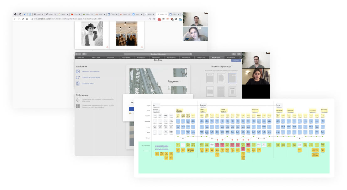
I conducted interviews with clients and did service safari to understand the whole journey of interaction with the service and main pain points.
I used Google Analytics to understand channels' profitability and clients' journeys.
I used Yandex Metrics to look at users' interactions with the website and identify design problems.


As a result, I did CJM covers all main steps from shooting a photo to using the ordered product and purchasing the next one.
The main service touchpoints
Website
Editor
App
Delivery
Product
Challenges
It was hard to navigate through the website and the app to find the right product, their architecture needed to be redesigned from both UX and marketing points of view.
The most painful stages for clients were editing a product and choosing the right product. Moreover, there was a lack of internal design methodology and culture.

Choosing the product
The editor was rigid, uncomfortable and needed to be redesigned for the website and the app.
Editing the product
The UI of the website, the editor and the app was old, inconsistent, and needed to be redesigned and become holistic.
Visual inconsistency
There was a lack of design practice and a team to run a client-centric development of the service.
Lack of methodology
Design strategy
• Design mission
• Competitive design advantages
• Goal and tasks for design during 2020 - 2021
• Design KPIs
• Competitive design advantages
• Goal and tasks for design during 2020 - 2021
• Design KPIs

Design strategy included
To become a stylish and caring service that inspires to value memories and moments, and makes them easy to preserve
To identify the main direction for service design, I formed a design strategy, based on business strategy, that covered the whole client's experience.
Design mission
Design management
We managed the design process together with CTO. We were discussing ideas, prioritising tasks, planning time and resources, distributing responsibilities.
The process was iterative, including research, prototyping, testing, refining, developing and analysis phases.
The process was iterative, including research, prototyping, testing, refining, developing and analysis phases.

Holistic design system

To speed up and manage the design process more effectively on the one hand, and to create a holistic user experience throughout all digital products of Periodica on the other, we built a design system.
Website redesign


• Website architecture redesign
• Formed a clear products’ architecture
• Changed products’ presentation
• Analysed popular orders’ topics and added recommendations
• Updated products’ photo and video styles
• Designed a new UI
• Redesigned certificate
• Improved order and payment UX
• Formed a clear products’ architecture
• Changed products’ presentation
• Analysed popular orders’ topics and added recommendations
• Updated products’ photo and video styles
• Designed a new UI
• Redesigned certificate
• Improved order and payment UX
We've improved the website to simplify choosing the best product, to speed up getting essential information, to increase the effectiveness of ad campaigns and conversion to the editor.
Done
App redesign


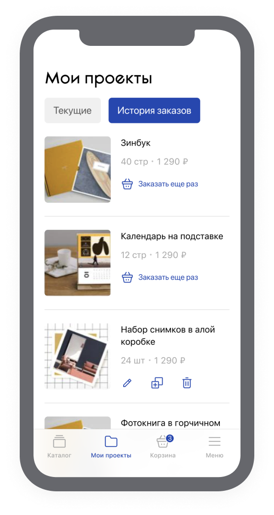
The same problems and goals as on the website were for the app. We simplified choosing the right product and searching for information, and increased conversion to the editor.
Editor redesign
The most complicated and important stage for clients while using a service was editing a product. Especially when it’s a photobook with 80 or even 160 pages. There was a huge churn and negative feedback on this step. Editing could take several days to finalize a product.
Research
First of all, we did user research for each type of product to see the whole editing process.
User research
Service safari
We did service safari to experience the same as our clients.
Design research
We checked competitive editors and international benchmarks.
As a result, we had a list of problems, insights, and hypotheses about the ideal editor for Periodica.
Strategy
Besides flexible editing scenarios, useful functions and intuitive interface, it was important to design the holistic experience across devices and platforms. Thus a client could start editing on mobile and continue on desktop or the app, and we can analyze the whole client's journey.
We set a goal
To make editing a pleasant, flexible and fast process for users


We totally redesigned the editor and formed a plan for implementing new functions.
Improving products design

• To experiment with page templates in photobooks.
• To create templates for new products fast.
• Easily navigate across templates in the editor.
• To build cross-products editing.
• To create templates for new products fast.
• Easily navigate across templates in the editor.
• To build cross-products editing.
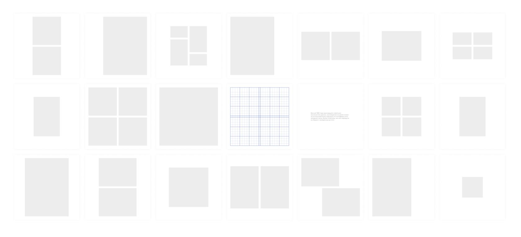
To achieve unification in photobooks design we created a grid system and added principles for placing content on pages.
It helps
New opportunities

To find ideas for new products and directions I did orders’ analysis. It unveiled the main clients' archetypes, popular topics and products, and interesting trends.
As a result, new wedding products have been launched. Moreover, I've done research and concept generation of a new wedding service.
As a result, new wedding products have been launched. Moreover, I've done research and concept generation of a new wedding service.
Effects
Main results
> 135%
increasing revenue
In comparison with 2019, 2021 has shown
> 70%
increasing users
> 100%
increasing transactions
> 180%
increasing of conversion to the editor
> 210%
increasing of conversion to the cart
Unfortunately, there is no accurate data about design impact on these results. The team had been doing marketing, adding new products, and implementing technical improvements at the same time. But users’ and team’s feedback tells about tangible design impact.
Users feedback
“I’m delighted, the book is wonderful, thank you very much!!! The editor is very comfortable, the function of moving pages is very helpful, from now on this is the way I want to print all my photos <3”
“I like your website very much. It’s simple, capacious and pleasant. It’s easy to upload photos and create a layout. Saving clients time is about care – that’s very cool!”
“Editing my book was very pleasant! It immersed me in that time. I disposed of my photos in the order I like. The editor is comfortable!“
“Now it’s much more comfortable! I can work with the whole spread. I can look through all spreads at once and change positions easily. The tips about the print quality of a photo are very useful – it helps to find the better photos.”

Team's feedback
CEO
Varya Vedeneeva
“We’ve simplified the journey to the cart. We’ve made the editor much more comfortable. We’ve designed a logic of choosing products on the website and the app, which simplifies the users' tasks. We’ve created “recommendations”. We’ve redesigned the certificate, which has increased its purchase.”
CTO
Dima Alexeev
“We've made a huge leap from the previous version. Almost every side of our work has had a qualitative shift. We’ve done really cool things.
We’ve got a strategy and now we can move forward, and not only fix bugs and do routine. As a result, we’ve got systems, groundworks and ideas, which we use and implement.”
We’ve got a strategy and now we can move forward, and not only fix bugs and do routine. As a result, we’ve got systems, groundworks and ideas, which we use and implement.”
Head of support
Katya Gordeeva
“We didn't have systematic processing of users feedback before. But now we’ve got a development strategy based on what is important for users, and this is great! Interviews, tests, talks with people about their needs – all that have enhanced trust and loyalty to the brand.
I’m lost for words about the new website! It’s delightful! The website has become friendly and fast. Now there is no need to be prepared beforehand to create a photobook. All changes have reduced the pressure of typical requests on support. I believe that our users have become happier!”
I’m lost for words about the new website! It’s delightful! The website has become friendly and fast. Now there is no need to be prepared beforehand to create a photobook. All changes have reduced the pressure of typical requests on support. I believe that our users have become happier!”
Dima Alexeev
Team
Time
Expertise
CTO
Kate Gordeeva
Head of support
1.5 years
Research
Analysis
Concept generation
Prototyping
Testing
Strategy
Management
Analysis
Concept generation
Prototyping
Testing
Strategy
Management
Kostya Zhuk
UI designer
Vitaly Fedosov
Service / UX designer, manager

